Inside/Out
Stephanie Ross
Senior Degree Project |
Richard Rose
Senior Degree Project
Architecture Journal
After working on a preliminary redesign for the Int/AR journal during wintersession, I was left feeling as though there was more to be done. I wanted to create a project as a platform to challenge myself and the existing notion of what the form and functionality of journal/magazines are today in the architecture world.
I conducted research by looking at the way different publications functioned and appeared. Many were extremely straightforward, but a select few were so far on the other side of the spectrum and displayed loud, flashy embellishments. Most of the publications organized their content in a similar way, but some were better than others in identifying key points to the reader. One of my goals was to improve the functionality of the journal. Architecture contextualizes you physically and emotionally, as surroundings put a inhabiter in a certain state of mind. I wish to include these aspects from architecture and include them in the creation of a journal that allows the reader to discover new information, but also provides them with a participatory experience to make the intake of research conceptually consistent with the experience of being in an architectural space. I wanted to take on this challenge, but also keep in mind finding the right balance between something as elegant as a minimalist spread and the character of a more experimental approach. This project also allowed me to delve further into the world of architecture, which I was briefly introduced to during wintersession and wanted to learn more about.
Many of the research and initial ideas about the journal came from the idea of interior and exterior, and examining their relationship and how they interact in different settings. This informed many of the decisions that were made concerning the content and design of the journal, and also gave way to the title of the publication, “Inside/Out”. It also influenced me to create special edition supplements that would be delivered with the standard issue quarterly.
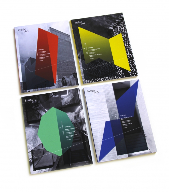
To reinforce the idea that architectural practices served as a foundation, a grid was created that derived from the two-point perspective grid used in architectural drawings. Shapes and forms were derived from this grid and were used as functional forms within the standard 8.5 x 11 in pages of the journal. A single shape was chosen for each issue and assigned a color. This shape and color appear throughout the issue and with the grid it was derived from, creates form in the journal. Also on the cover are surrounding elements that put the shape in a space and connect it to the background image it overlaps. On the back of the issue, the grid reveals the source of the shape in a light gradient while the features of the journal are arranged in a floating composition. To complete the exterior of the journal, a masthead was created that plays with the idea of interior and exterior space and how the fords sit in that space. The angle used in the masthead also has a relation to the grid, and sits consistently in the top left corner of the front cover.
The interior of the journal is typeset in United for headlines and Swift for body text, and is printed in two colors: black and the color used on the cover to create a bold aesthetic and also to emphasize that that is the only color that appears in the issue. The color is used to notate titles, page numbers, captions, and forms throughout the journal. The main body
1 of 2
STEPHANIE ROSS/DP PROPOSAL/SPRING 2012
text and many of the images are printed in black and white. Different elements are used throughout the journal such as the grid showing through, large page numbers, key pieces of information highlighted, overlapping color shapes, grid overlays on full-bleed images with cut-outs for captions, and a subtle grey gradient that is a motif repeated from the cover. The journal utilizes these formal features to highlight and point to information, not just acting as decorative but functional as well.
In the standard issues, things are labeled in terms of how they are establishing space and where they are establishing space. In another element, I want to ask readers to participate in a specific way through special issues that are included with the standard. The special editions consist of miniature supplements that contain only one article presented in a new form, dealing with themes in architecture. The forms encourage participation and inquiry, playing off of the idea that architecture is meaningless without human interaction and because of this, each special edition is titled with a verb. These special editions, while different forms, are contained in the same packaging to show they are part of a collection, and includes an instruction sheet, and other small tokens such as stickers and notebooks.
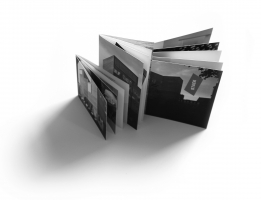
The first special edition is called “Build” and demonstrates how the journal can act as an object that is broken up into separate parts. The order of reading lies in the readers hands and allows them to act as their own editor, choosing how they digest the information presented to them. After the content has been read, the reader is free to create a structural form, bringing architectural structures to life. In “Roll”, a second special edition, the article is contained in a scroll form. The form deals with the relationship between interior and exterior, because a scroll is a form that allows the transition of a surface as an exterior to an interior. Images are displayed on the back and test on the front, so only pieces of the image can be seen when the article is being read. Only after the article is completed will the reader get a glimpse of the entire project. In “Stack”, the third special edition, the issue acts as a way to demonstrate the function of a foundation and subsequent contraction that happens in architectural projects. This form emphasizes that the content inside deals with a project that is built and exists in a site. This form also allows three different articles about a project in the same issue, each exploring a different aspect of the building presented.
All of these components come together to create a different experience and way to learn more about what is going on today in the world of architecture, and provides a more exciting, insightful way to present ideas from the minds of creative individuals.
2 of 2
Spring 2012
Senior Degree Project | Richard Rose
Senior Degree Project
Architecture Journal
After working on a preliminary redesign for the Int/AR journal during wintersession, I was left feeling as though there was more to be done. I wanted to create a project as a platform to challenge myself and the existing notion of what the form and functionality of journal/magazines are today in the architecture world.
I conducted research by looking at the way different publications functioned and appeared. Many were extremely straightforward, but a select few were so far on the other side of the spectrum and displayed loud, flashy embellishments. Most of the publications organized their content in a similar way, but some were better than others in identifying key points to the reader. One of my goals was to improve the functionality of the journal. Architecture contextualizes you physically and emotionally, as surroundings put a inhabiter in a certain state of mind. I wish to include these aspects from architecture and include them in the creation of a journal that allows the reader to discover new information, but also provides them with a participatory experience to make the intake of research conceptually consistent with the experience of being in an architectural space. I wanted to take on this challenge, but also keep in mind finding the right balance between something as elegant as a minimalist spread and the character of a more experimental approach. This project also allowed me to delve further into the world of architecture, which I was briefly introduced to during wintersession and wanted to learn more about.
Many of the research and initial ideas about the journal came from the idea of interior and exterior, and examining their relationship and how they interact in different settings. This informed many of the decisions that were made concerning the content and design of the journal, and also gave way to the title of the publication, “Inside/Out”. It also influenced me to create special edition supplements that would be delivered with the standard issue quarterly.
To reinforce the idea that architectural practices served as a foundation, a grid was created that derived from the two-point perspective grid used in architectural drawings. Shapes and forms were derived from this grid and were used as functional forms within the standard 8.5 x 11 in pages of the journal. A single shape was chosen for each issue and assigned a color. This shape and color appear throughout the issue and with the grid it was derived from, creates form in the journal. Also on the cover are surrounding elements that put the shape in a space and connect it to the background image it overlaps. On the back of the issue, the grid reveals the source of the shape in a light gradient while the features of the journal are arranged in a floating composition. To complete the exterior of the journal, a masthead was created that plays with the idea of interior and exterior space and how the fords sit in that space. The angle used in the masthead also has a relation to the grid, and sits consistently in the top left corner of the front cover.
The interior of the journal is typeset in United for headlines and Swift for body text, and is printed in two colors: black and the color used on the cover to create a bold aesthetic and also to emphasize that that is the only color that appears in the issue. The color is used to notate titles, page numbers, captions, and forms throughout the journal. The main body
1 of 2
STEPHANIE ROSS/DP PROPOSAL/SPRING 2012
text and many of the images are printed in black and white. Different elements are used throughout the journal such as the grid showing through, large page numbers, key pieces of information highlighted, overlapping color shapes, grid overlays on full-bleed images with cut-outs for captions, and a subtle grey gradient that is a motif repeated from the cover. The journal utilizes these formal features to highlight and point to information, not just acting as decorative but functional as well.
In the standard issues, things are labeled in terms of how they are establishing space and where they are establishing space. In another element, I want to ask readers to participate in a specific way through special issues that are included with the standard. The special editions consist of miniature supplements that contain only one article presented in a new form, dealing with themes in architecture. The forms encourage participation and inquiry, playing off of the idea that architecture is meaningless without human interaction and because of this, each special edition is titled with a verb. These special editions, while different forms, are contained in the same packaging to show they are part of a collection, and includes an instruction sheet, and other small tokens such as stickers and notebooks.
The first special edition is called “Build” and demonstrates how the journal can act as an object that is broken up into separate parts. The order of reading lies in the readers hands and allows them to act as their own editor, choosing how they digest the information presented to them. After the content has been read, the reader is free to create a structural form, bringing architectural structures to life. In “Roll”, a second special edition, the article is contained in a scroll form. The form deals with the relationship between interior and exterior, because a scroll is a form that allows the transition of a surface as an exterior to an interior. Images are displayed on the back and test on the front, so only pieces of the image can be seen when the article is being read. Only after the article is completed will the reader get a glimpse of the entire project. In “Stack”, the third special edition, the issue acts as a way to demonstrate the function of a foundation and subsequent contraction that happens in architectural projects. This form emphasizes that the content inside deals with a project that is built and exists in a site. This form also allows three different articles about a project in the same issue, each exploring a different aspect of the building presented.
All of these components come together to create a different experience and way to learn more about what is going on today in the world of architecture, and provides a more exciting, insightful way to present ideas from the minds of creative individuals.
2 of 2